
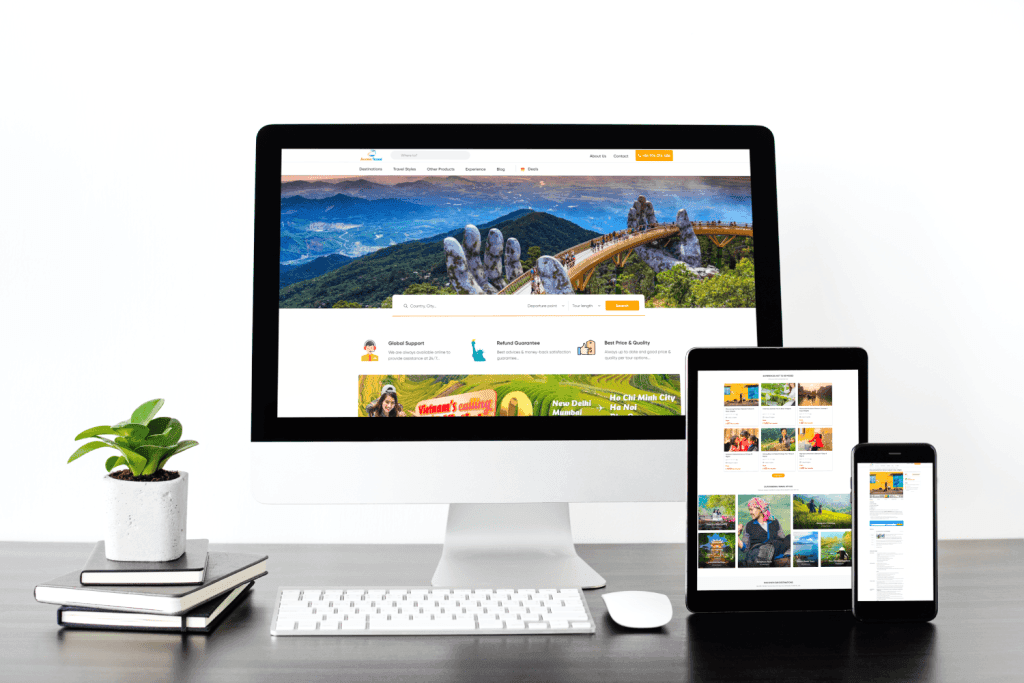
What is a responsive website?
Responsive website Responsive websites are a type of website that can automatically adjust its interface to fit the screen size of the user's device. They use CSS and JavaScript techniques to change the layout, font size, images, and other elements to display optimally on all devices, from desktops and laptops to tablets and smartphones.
Benefits of responsive websites:
- Enhance the user experience: Website responsive giúp người dùng có thể truy cập website dễ dàng và thoải mái trên mọi thiết bị, mang lại trải nghiệm nhất quán và hiệu quả.
- Improve SEO effectiveness: Google prioritizes responsive websites in search results, so a responsive website can help you attract more visitors.
- Cost savings: Instead of designing and managing multiple separate websites for each device, responsive websites save you time and money.
How to design a responsive website:
- Use layout fluid: Layout fluidity refers to a layout that can flexibly adjust to the screen size.
- Use media queries: Media queries are CSS code that helps you define different display styles for a website on different screen sizes.
- Use responsive images: Responsive images are images that can automatically resize to fit the screen of a device.
- Use responsive fonts: Responsive fonts are fonts that can automatically resize to fit the screen of a device.
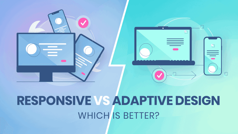
What is an Adaptive Website?
Adaptive website This type of website is designed with multiple versions for common screen sizes such as desktops, laptops, tablets, and smartphones. Each website version has its own interface optimized for the corresponding screen size, providing the best user experience on each device.
The difference between responsive websites and adaptive websites:
| Characteristic | Responsive website | Adaptive website |
|---|---|---|
| Interface customization capabilities | Automatic adjustment | Fixed by version |
| Number of versions | One version | Multiple versions |
| Design costs | Lower | Higher |
| Easy to manage | Easy | More difficult |
| User experience | Consistency | Suitable for all screen sizes. |
| SEO effectiveness | High | Medium |
Which type of website should I choose?
The choice of website type depends on your needs and budget. If you want a website that is low-cost, easy to manage, and provides a consistent user experience across all devices, then a responsive website is the right choice.
However, if you want a website that is perfectly optimized for every screen size and provides the best user experience for every device, then you might consider an adaptive website.
Conclude:
Both responsive and adaptive websites have their own advantages and disadvantages. Choosing the right type of website depends on your needs and budget.
EZ Fast Tech: Professional website solutions, SEO optimized, responsive design.
With a team of experienced and dedicated professionals, EZ Fast Tech is proud to offer comprehensive website design and development services, helping you build a professional, SEO-optimized website:
- Concept development and custom website design
- SEO-optimized website development with fast page loading speeds
- Optimize content, images, and videos
- Providing website maintenance and support services
Hãy liên hệ ngay với EZ Fast Tech hôm nay để được tư vấn chiến lược kiến trúc phần mềm phù hợp và nâng tầm mạnh mẽ nền tảng trực tuyến của bạn!
- Website: https://ezfasttech.com
- Hotline: 0768945786
- E-mail: [email protected]
- Facebook: https://www.facebook.com/ezfasttech
- LinkedIn: https://www.linkedin.com/company/ez-fast-tech/